


Social Distortion
“Yeah ,we wore a little make-up , so what ..?” – Chris Reece, Social Distortion


Restless vs Epic
I had a lot of close friends in the Social Distortion orbit back in the day… artists, musicians, record label types, etc. It felt inevitable we would eventually come together and work on band photography.
My 1st album packaging project with Social D was for their second studio album in 1989. It turned into a combination of photo & design, kind of a big deal, thanks to Jim Guerinot and Restless records.
I wanted to avoid Quark, Illustrator, and even Photoshop, all together – if possible on this one – do a more in camera packaging thing…
Walking around the Brewery in downtown L.A., I stumbled on this utility cover that just had such great texture and even had “LA” stamped into it. So, I ran home and grabbed a crowbar & a dolly.
Once in the studio I knew I wanted the logo for this cover to be classic Blackletter with a heavy Harley Davidson vibe, so I conned a great artist/painter, and my roommate at the time, Steven Sumney, into designing the front and painting it on the cement cover for me. (illustration program avoided completely – Boom!). When that was finished, I quickly realized ALL the photos needed to be done this way too – basically start a still life shot.
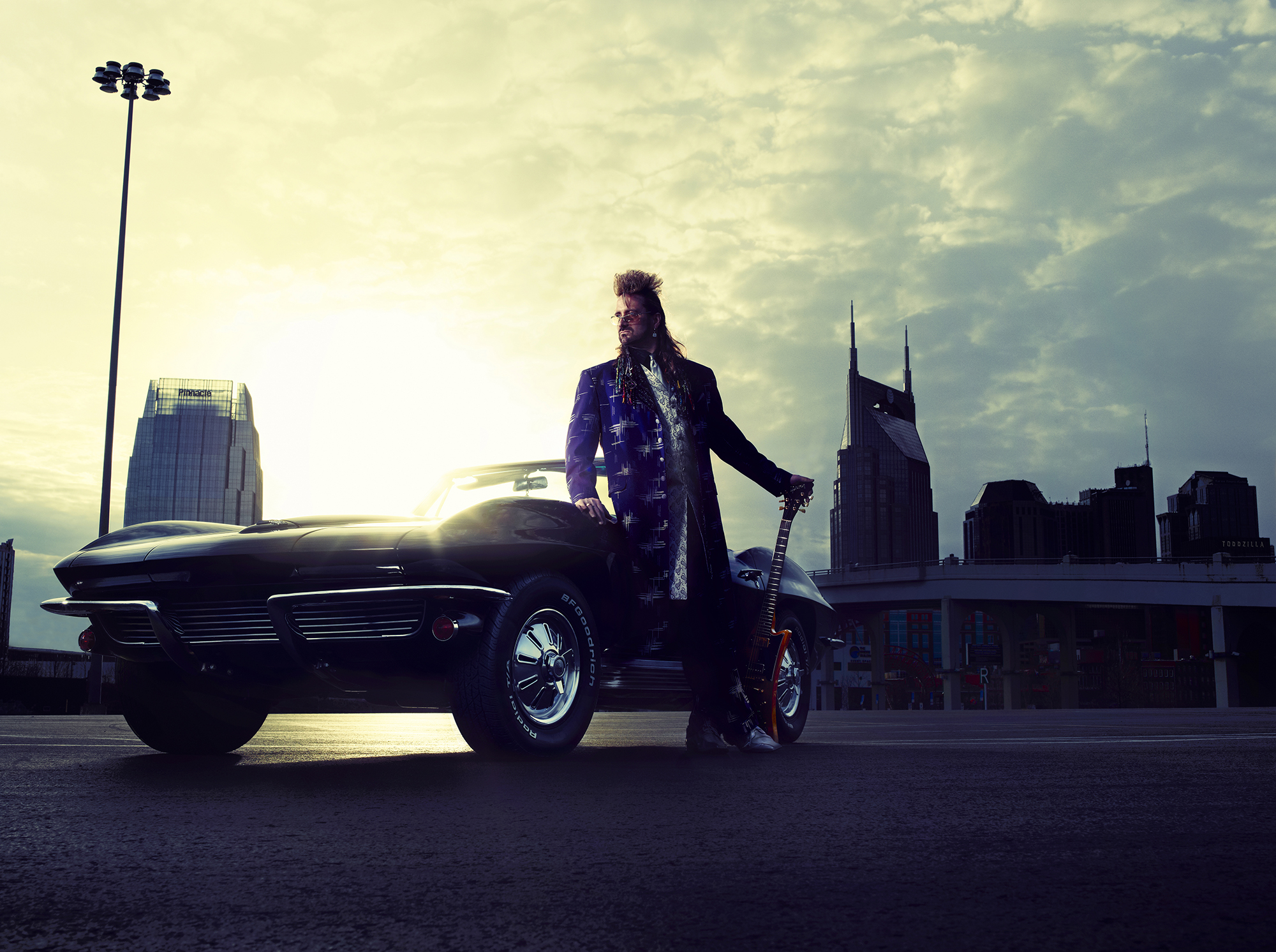
Shooting Social Distortion was always a blast! They knew knew all the best locations, albeit in the seediest parts of town, which frankly, without the boys in tow, would doubtfully get used out of fear over safety. Somehow, with Social Distortion it seemed safe and oddly, completely normal.
The band already had their own wardrobe and didn’t need a stylist or makeup – they were self-sufficient in that regard, and came with a completely finished look, ready to go. All I had to do was point the camera in the right direction – they did the rest! Props and cars were no problem – everything you needed was always right on hand with Social Distortion. They were a fully functional, self-contained, operation.
Post production on this was also fun & cool – I used 4×5 Kodalith film and Ilford B&W fiber paper to make the prints and transparencies (using Dektol instead of AB solution to get more mid-tones out of the Kodalith film). Then I manually scratched, burned, or contaminated, the film and paper to age it aggressively. Did lots of copies, so I had extras to experiment with…the whole process was a joy.
On to the next album…
In 1990, Epic records picked up Social D and the boys took me along for the ride. Mike Ness had been collecting vintage B&W photography, so we decided on a style sorta like a Punk Rock flyer, but with a bit more imagery collaged in from Mike’s collection.
The bulk of the images were from 1920 – 1940, depicting Prohibition, strippers, bondage, and gangster stuff… tommy guns and the like. Knowing this needed to be “more commercial”, we used some editing to take the edge off, and with some manipulation and hi-contrast work, the images were tamed down to be way more arty, and more of a full page designed background.
I handed in the comp, and the return phone calls from the label came to a full stop. Then I heard through the grapevine, the art department had freaked, and the legal department had imploded. Something to do with obscenity and copyright laws? Honestly, I thought it had already been cleaned up for that litmus test, and the images could easily be altered, masked and degraded further for more obscurity if required. The copyright thing I wasn’t sure about, but still… I figured with enough manipulation that should be fine. Apparently, that was not a battle the label was even willing to consider, let alone show up for.
It wasn’t that I didn’t get it from a business standpoint, I suppose… first major-label release from a newer artist… okay, I’ll give them that. I heard an illustrator was hired to do more… “polite imagery”, which still had the collage vibe.
I was pretty much out of the loop at this point, but before the cover comps, I did have to do some studio photos for the band, which Epic needed as new press photos for their use. These “press photos” ended up being used in the packaging.
Many chain stores refused to sell the album because of the cover… even with the toned-down illustration. So, I guess the 1st designs causing an implosion in the art department was not entirely without merit (my bad).
If you’re ever curious about why I’ve more or less retired from band photography, this story is a good place to start. In the years since, what happened with Epic only became increasingly more common, and far more frustrating. Layers upon layers of red tape. And really, it’s a damn shame for everyone other than the record labels. It’s the artists, the photographers, the designers, and the fans who ultimately get shafted.